You’ve found home. Now, get lost. Lost in Family. Lost in Friends. Lost on the Lake. Sweeping Lake Views are the showcase of this subtly complex, clean modern space. Hand crafted, personal style, and natural elements create the foundation for this clean Gallery Inspired Home.
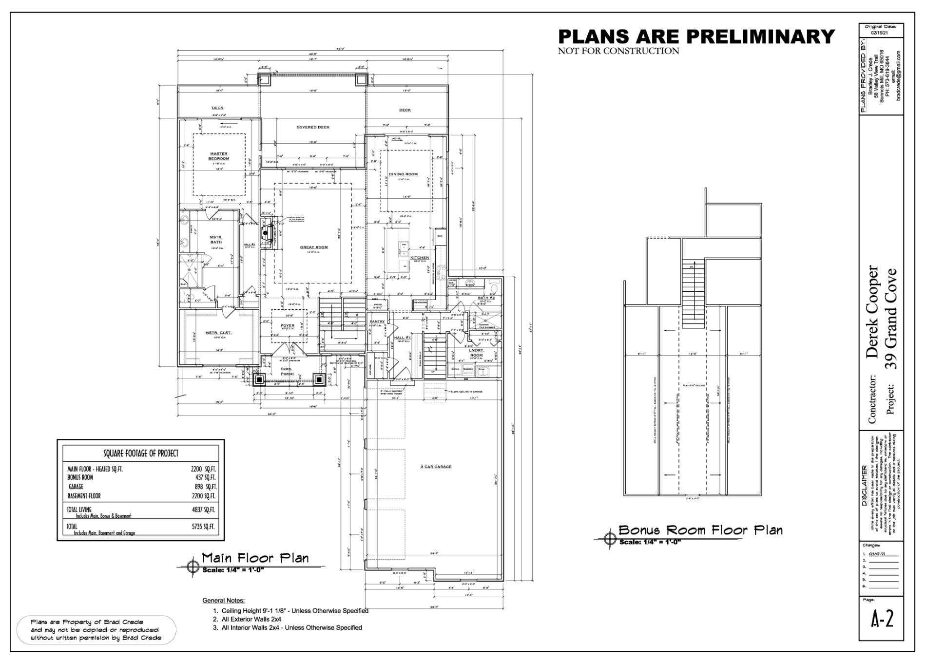
What better place to start? A beautiful plot and a set of detailed architectural drawings. We will help you bring your dreams to life!
Oooweee, no one said this space was quiet. It is definitely a project in process. In full Punch List Mode…
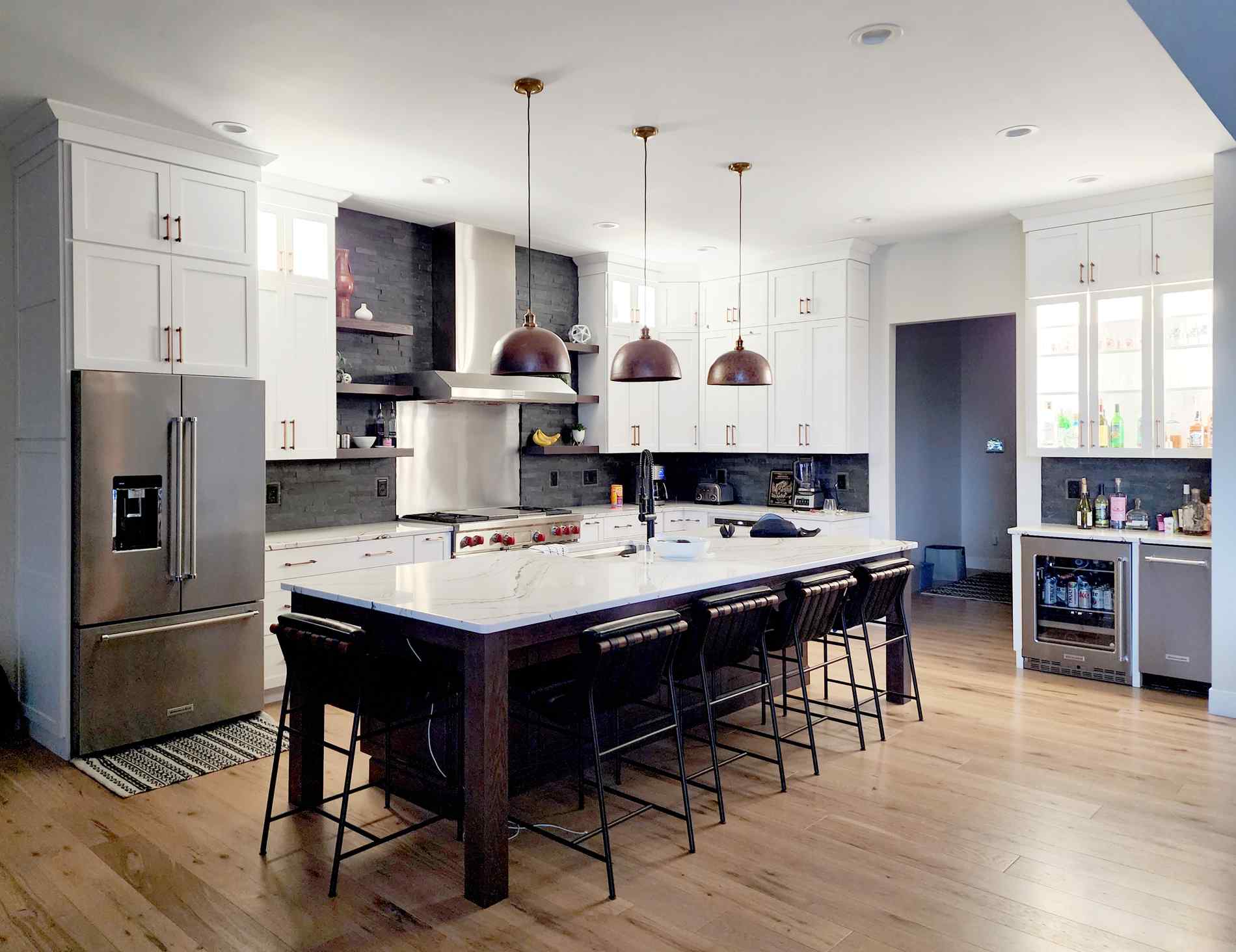
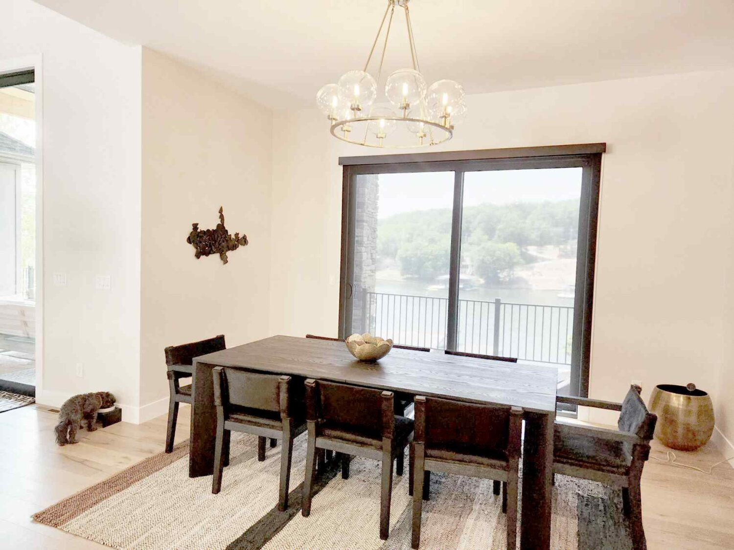
Throughout the house, we have pulled modern yet rustic elements together. This RH Black Stained Oak Table with Hair-on-Hide Saddle Oak Chairs is just the right touch of Mountain Aesthetic. Unlacquered Brass Planters with enormous plants throughout the great room will bring the outside in during the winter months.
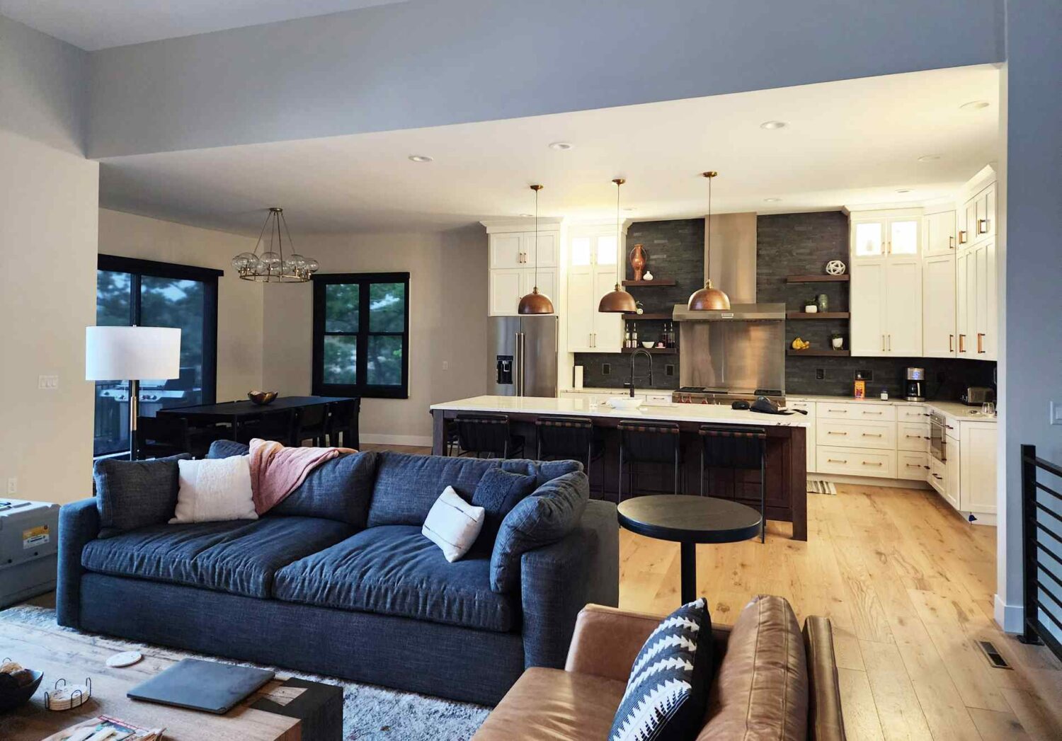
Time to get your party on!! Let’s pull it through the rest of the house. Rustic Wide Plank Oak floors keep this space relaxed and forgiving. Black Leather Denver Modern Vail Stools with Walnut Details balance the smokin’ hot camel leather in the Living Area. The Stacked Slate stone compliments but never competes with the Fieldstone Fireplace.
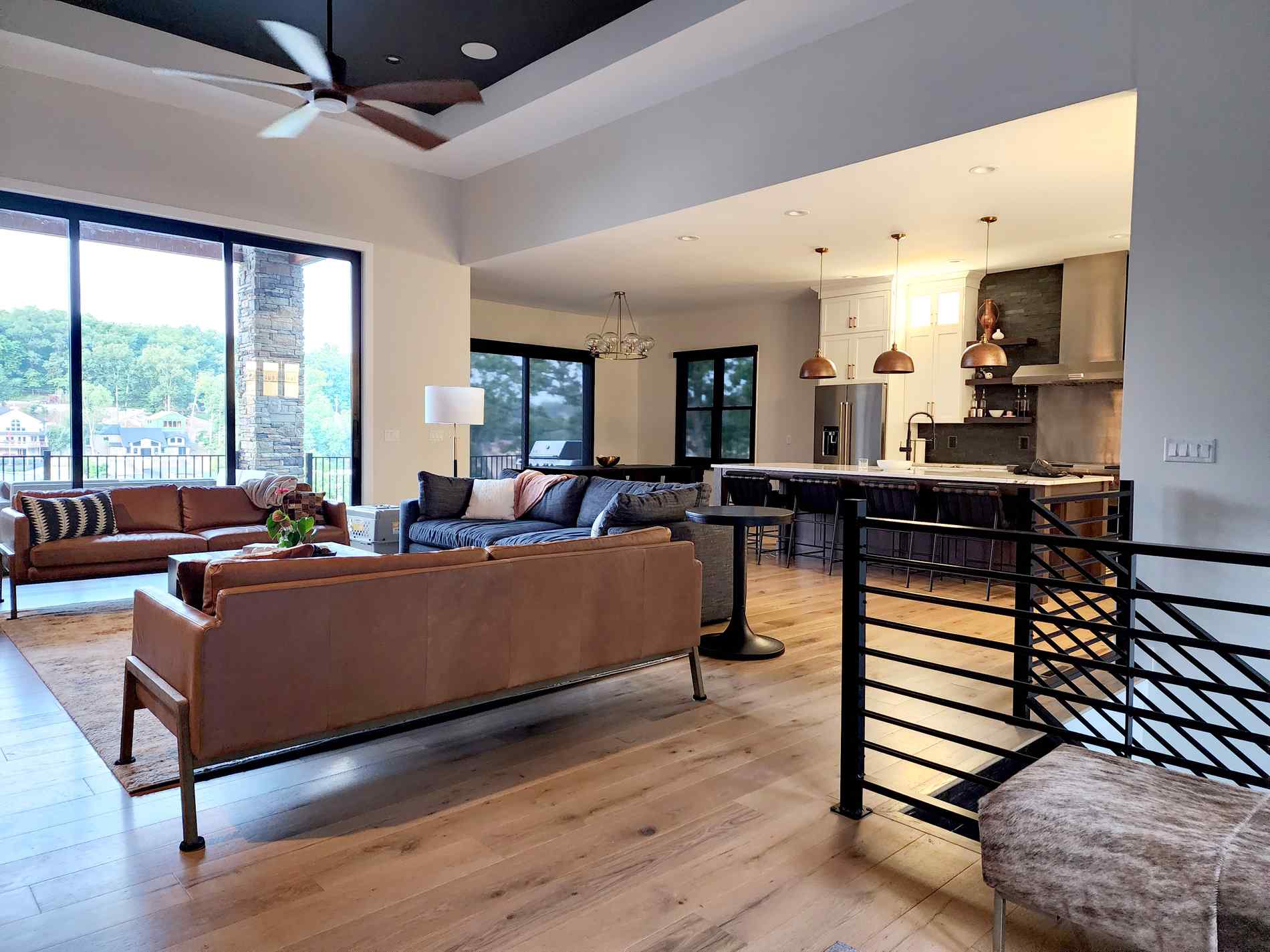
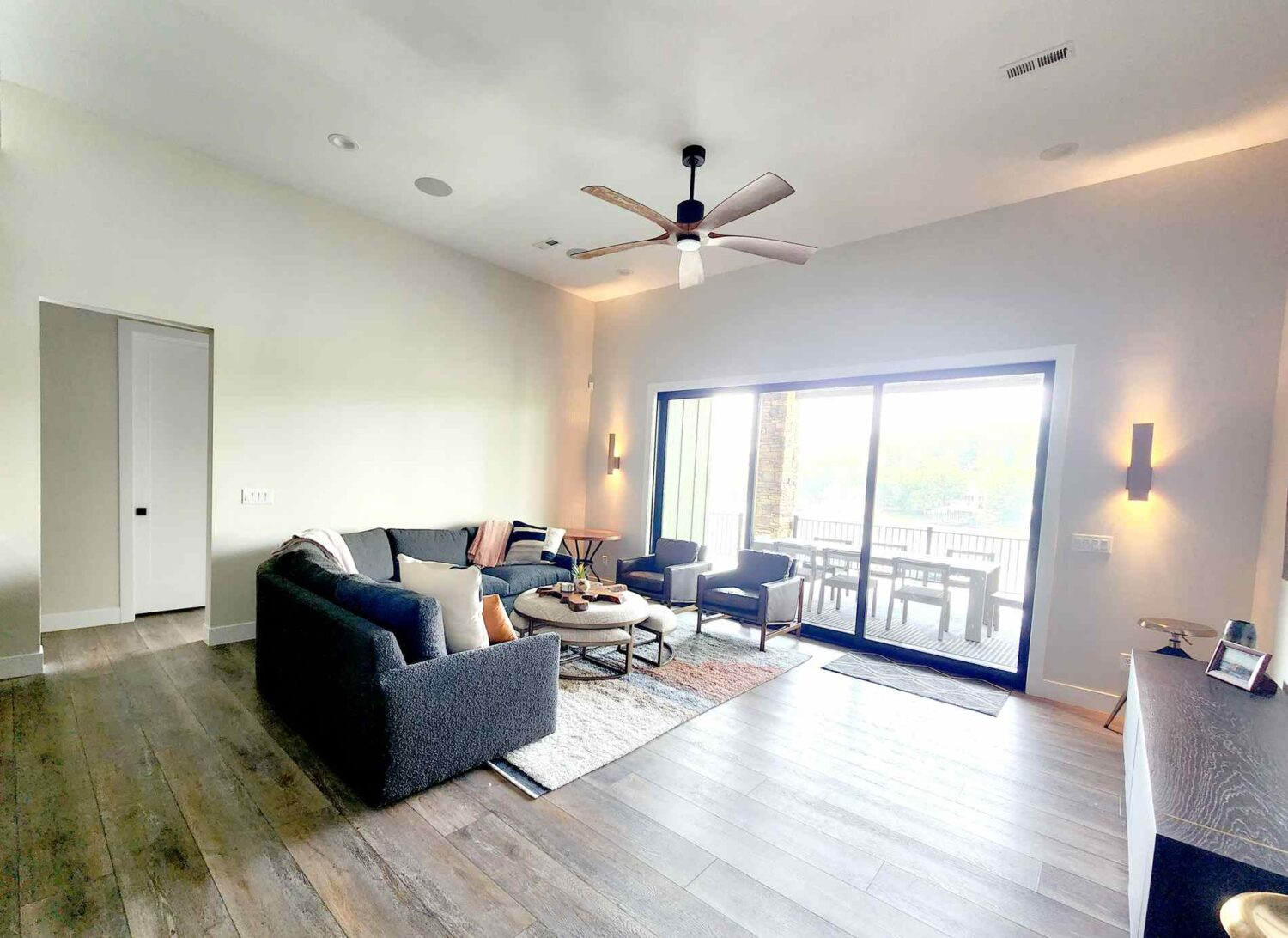
A work in progress….we want this Brand-Spanking-New Home to feel curated over the course of time; sometimes this requires patience. We don’t want this family space to feel kitsch, but we want a touch of theme in this gathering area. We create a direction for choosing accessories so the space can evolve with the family. We are forever on the hunt for photos and memorabilia from bygone summer seasons at the lake. In the end, décor is what really brings home the personality of the family as well as the house itself. We pulled LVP flooring throughout the lower level to provide warmth, continuity, and durability to this very active area.
Pulling Black Paint into the Master Suite not only makes this room feel chic and sophisticated but also, it brings black in from the Kitchen and Loft. In the bath, Black Countertops, Sinks and Tile give this room texture and character. We used globe shade lighting throughout the house to keep the space leaning modern. Black Elements contrasting the Pickled Oak Tile keeps this space light and bright.
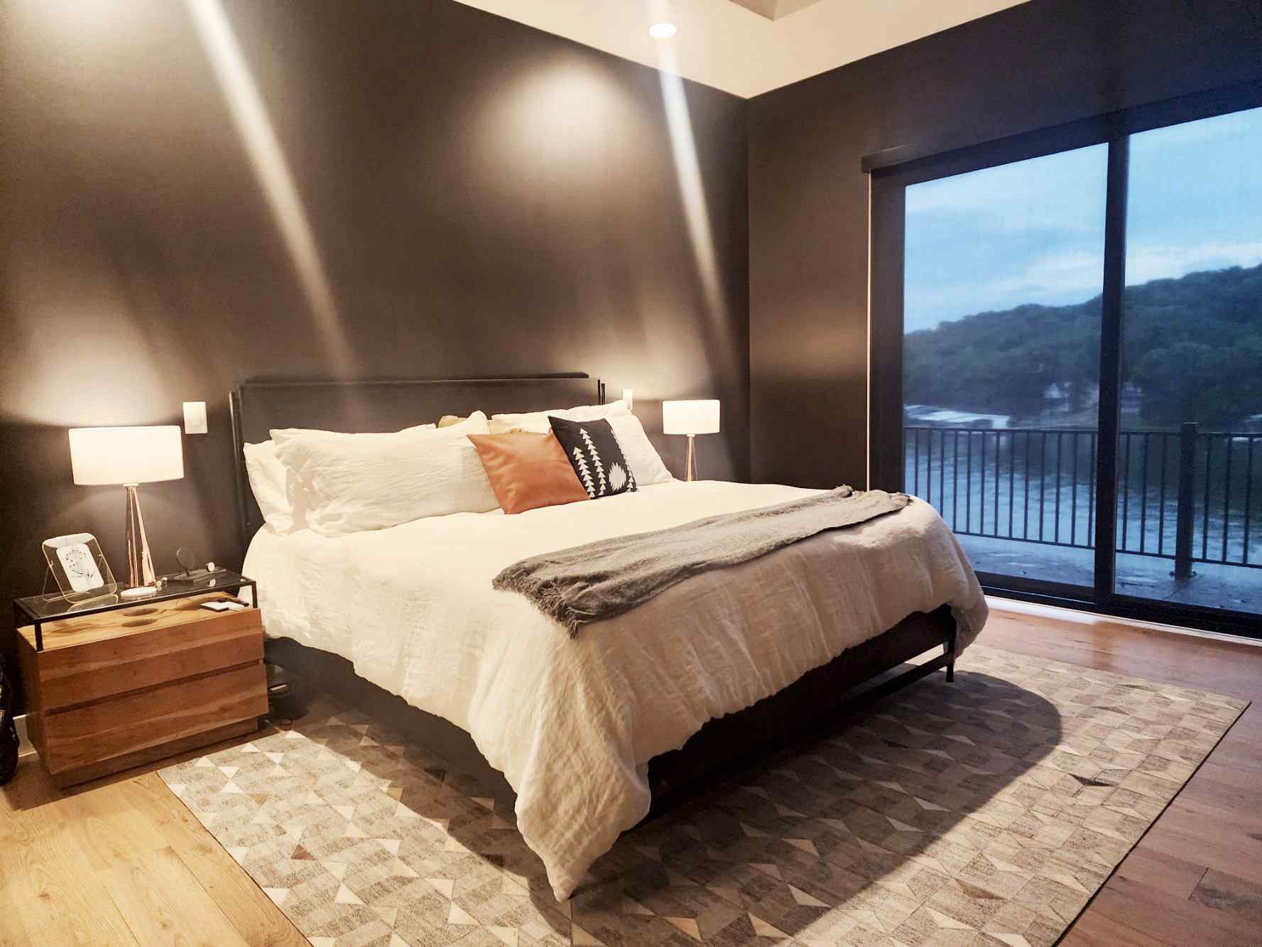
This Loft above the garage is painted in the Master Bedroom Black to balance the tones in the house. This weathered wood tile compliments the pickled wood tile in the Master Suite. This wallpaper gives this Powder Room/ Loft Bath an interesting touch. We pulled the Blackpool Matte Countertop into this bathroom which is on the same level with the Master Suite. The white sink reflects the Loft and compliments the White Tile in the Shower.
As we move to the Lower Level Suites, we wanted to create a natural environment. The back of the Lower Level is underground. What better way to give a feeling of warm and outdoors than green tile, and this fantastic wallpaper by Schoolhouse? We wanted a sweet room, and the Alpine Room delivers.
We added a black feature wall to the Lower Level Master Suite to pull the Upstairs Bedrooms Downstairs. We will pull nature into this room with greenery and accents. In the bath, we used Bedrosians Makoto Tiles in various shades and installation designs to keep everything pulled together.
Two bedrooms are Jack and Jill. To marry these spaces, we did interesting painting techniques to keep these rooms fresh and youthful; bring the outdoors in. We brought the camel leather from the living room into these bedrooms.
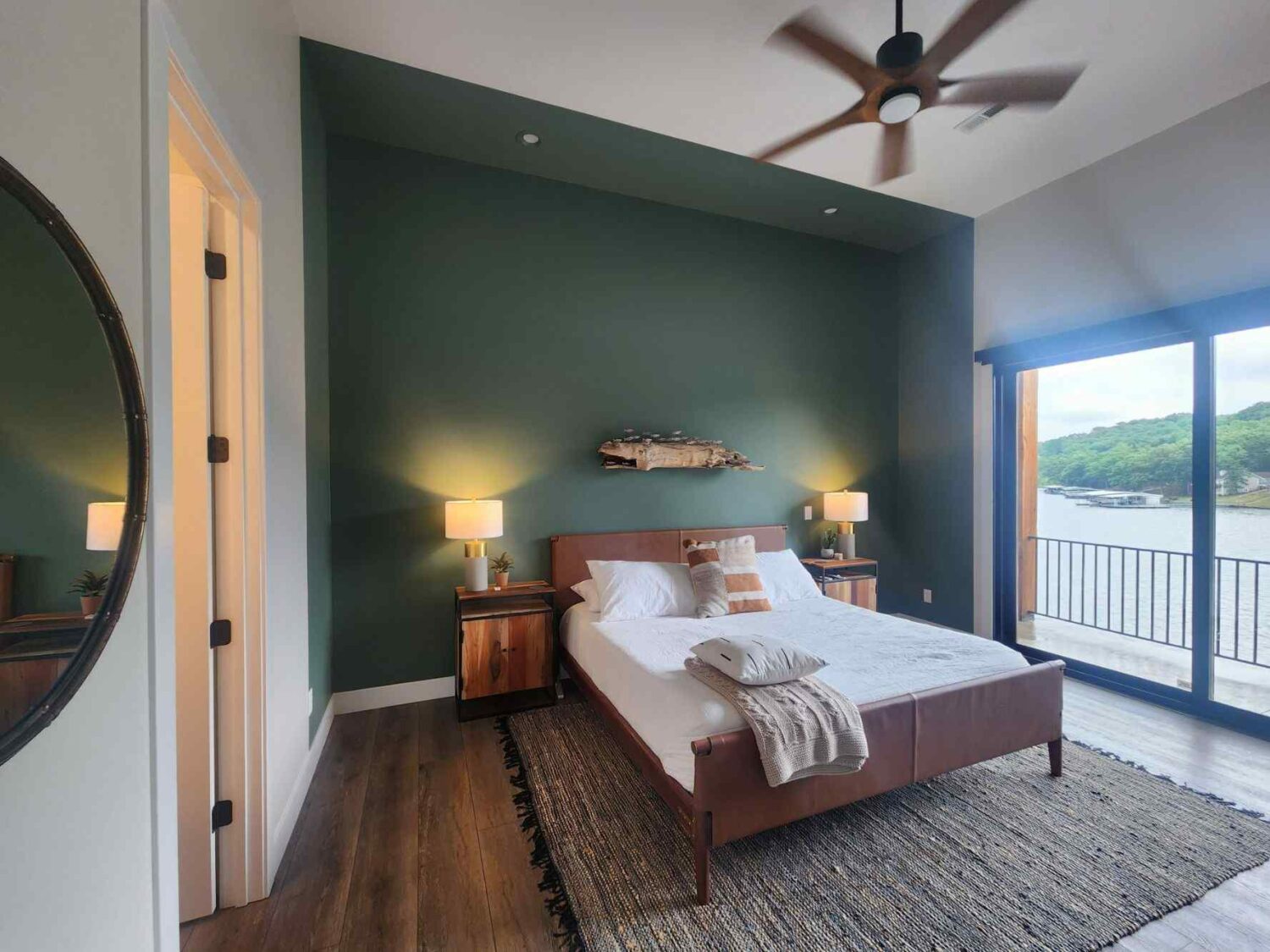
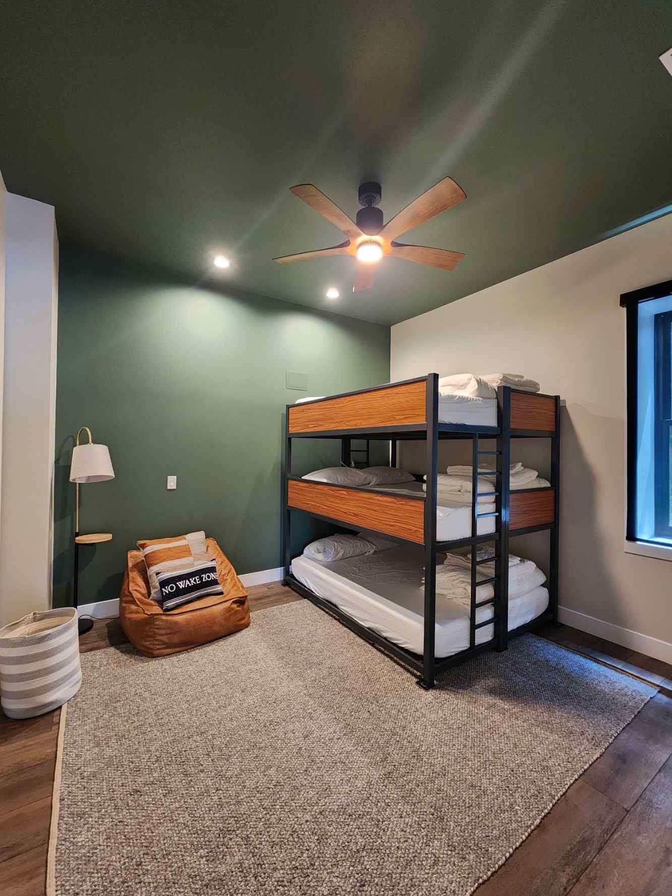
We always name our spaces. Not only is it fun, but also it helps keep things clear in moodboards. The name also creates a definite vibe. This room that sleeps six is designed for kids and young adults.
There are a whole lot of words we could use to talk about the exterior of this magnificent home, but this video does the talking for us. Every inch of this property is curated and coordinated inside and out.
Construction requires precision. It requires dialogue. Please contact us to set up a gentle introduction. We always start with Texting, Whatsapp or Email.